Waze
The Challenge
Waze is one of the most popular navigation apps in the world, with 130 million users in over 180 countries who collectively join their local voices to help beat traffic. An avid community of over 500,000 map editors also help document route changes. Waze is transforming the way people move by finding the best way in real-time by getting real-time updates from fellow drivers, who can share actionable data about accidents, traffic incidents, speed limits, and other trip information. The platform also offers Waze Carpool, a dedicated app that helps users plan rides with fellow commuters on a similar route with the purpose of reducing carbon footprint and traffic. Waze brand needs a universal system that enhances the platform’s collaborative spirit and provides a better experience on the road.
The Solution
This project was a major focus of my work in 2020. Within the Pentagram team Jen, as senior visual designer who is in charge of all the visual assets, I started with redrew the logomark design (Wazer), creating logo animation, and visual language animation (above), establishing a visual style guide for the icon, illustrations, and UI design. Collaborated with other designers and the Google Waze team to create a roadmap/guideline spanning over 200 pages, encompassing all usage details.
Credit on Pentagram Design Blog
The Studies
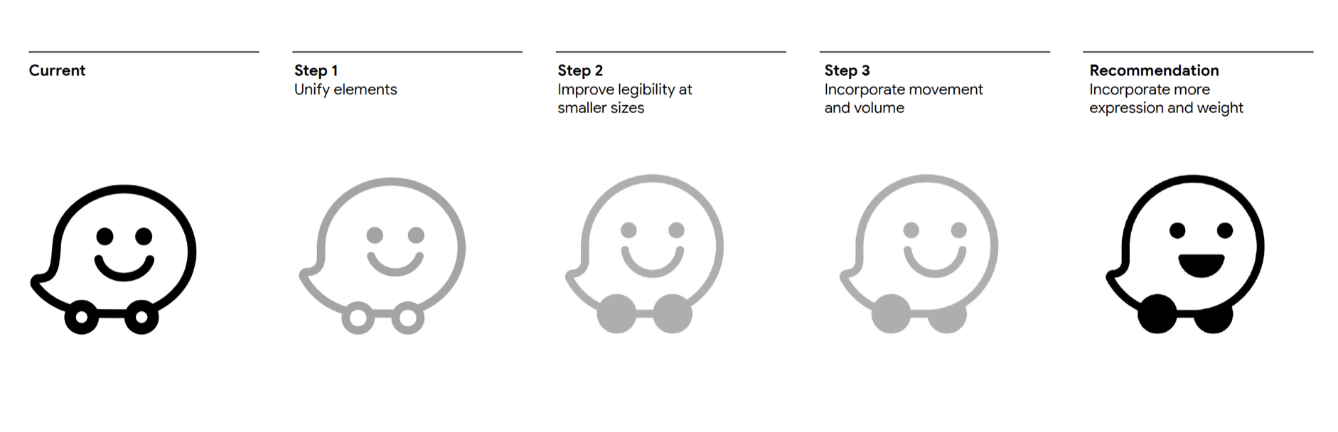
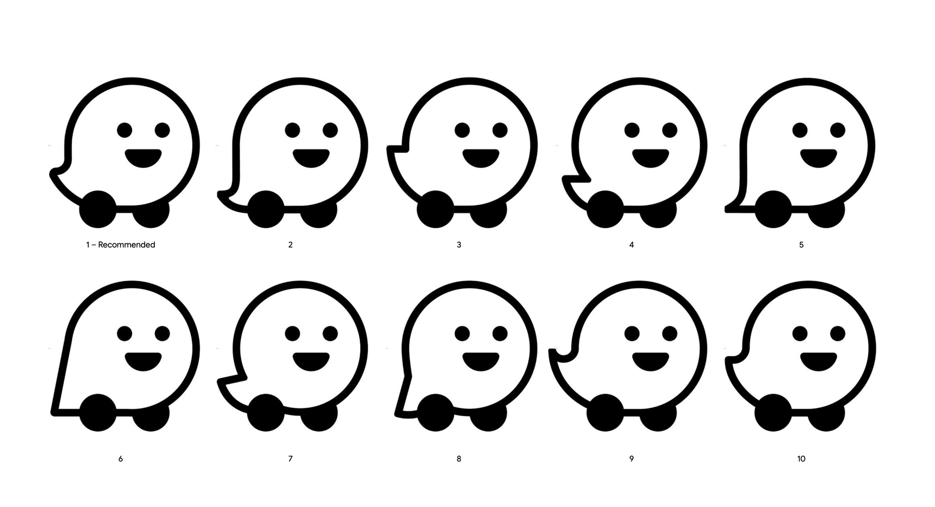
There are a lot of versions I studied in the earlier stage before got into the final version and final Wazer animation.
Waze symbol animation and logo animation created by me:
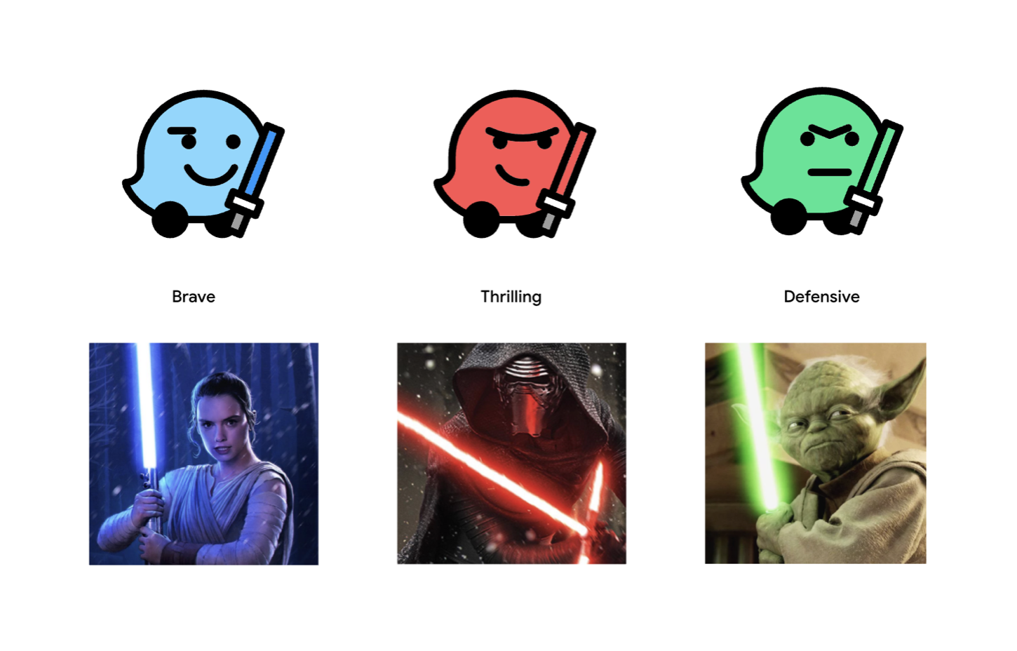
The Moods
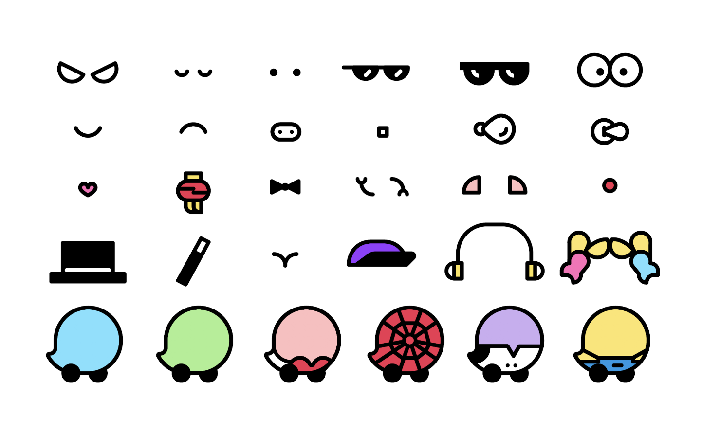
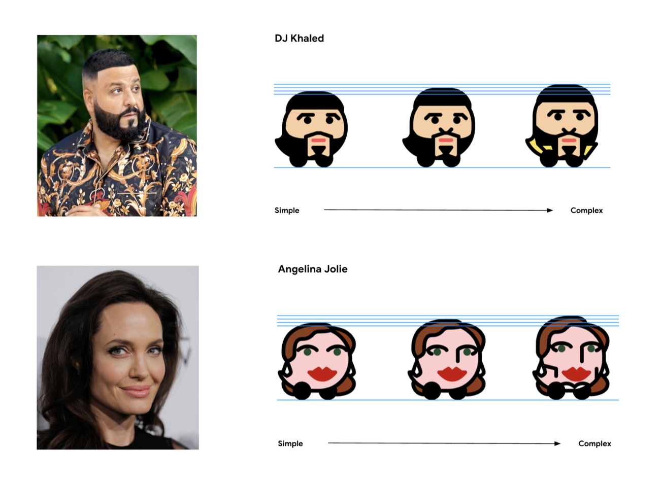
The new Moods are based on recognizable feelings or emotions expressed by a person or character, rather than on how they look. To capture as many feelings as possible, Waze conducted research with 13,000 drivers to find out how they described their daily commute. This helped guide and define the range of unique emotions for the new Moods, which capture feelings like Happy, Adventurous and Zombified with more clarity and humor than ever. The family of Moods is infinitely expandable, and extends to custom Moods for partnerships with other brands and celebrities.
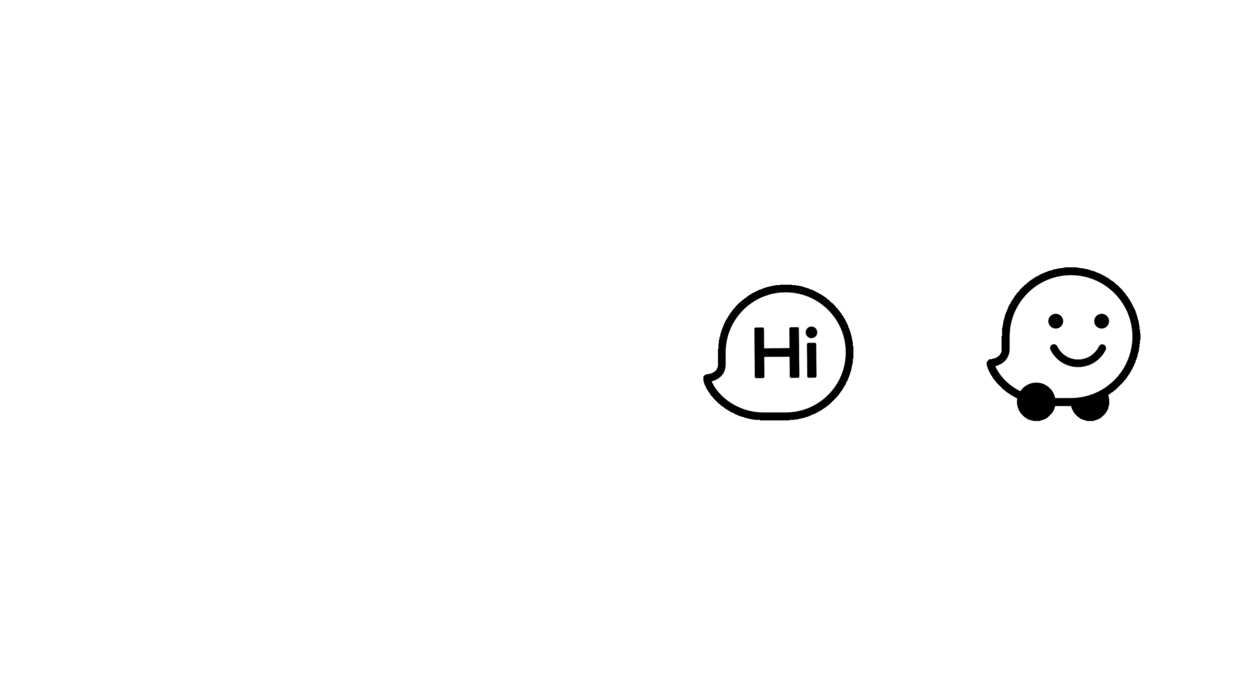
Along with the logo and Wazer symbol, the program updates core visual elements including the Moods for users’ driver avatars, speech bubbles and product icons, which I have carefully redrawn based on the same grid
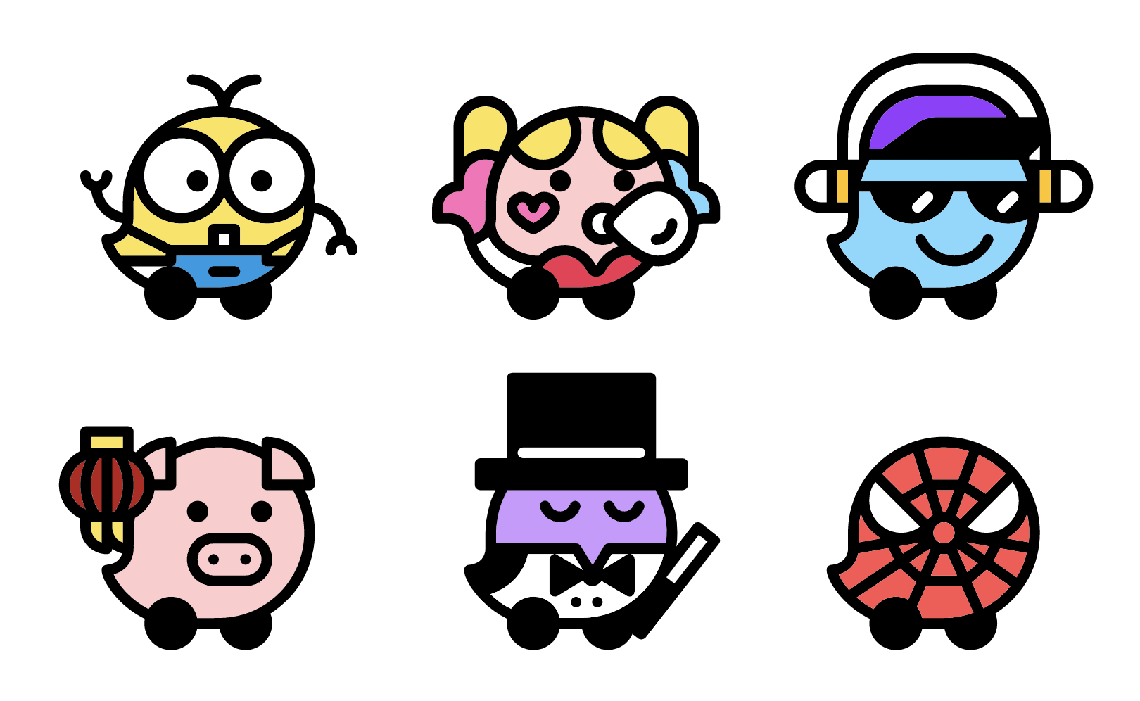
All mood studies and special events moods, drawn by me here:


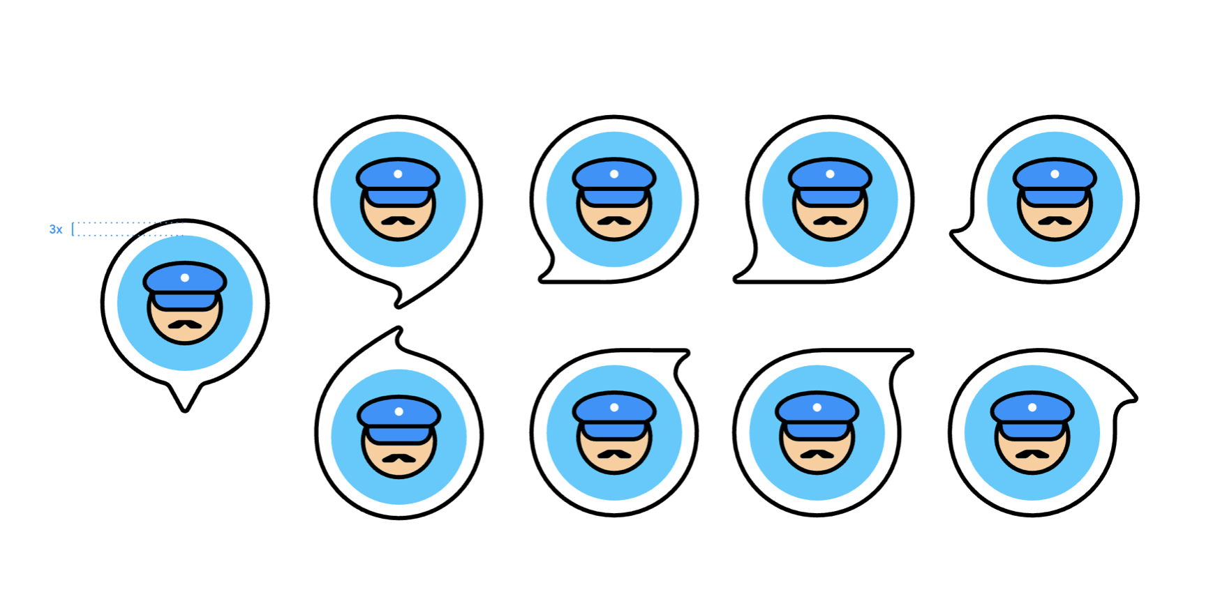
Iconic Symbol
The identity updates the iconic Wazer symbol, introduces a set of new “Moods” that help users more authentically express themselves within the app, and streamlines the platform’s signature use of illustration.
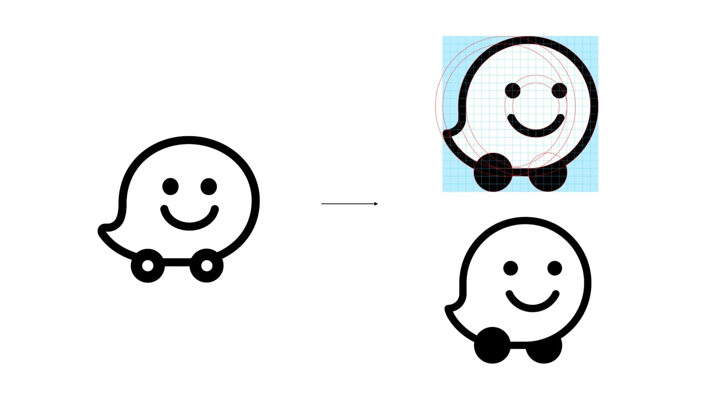
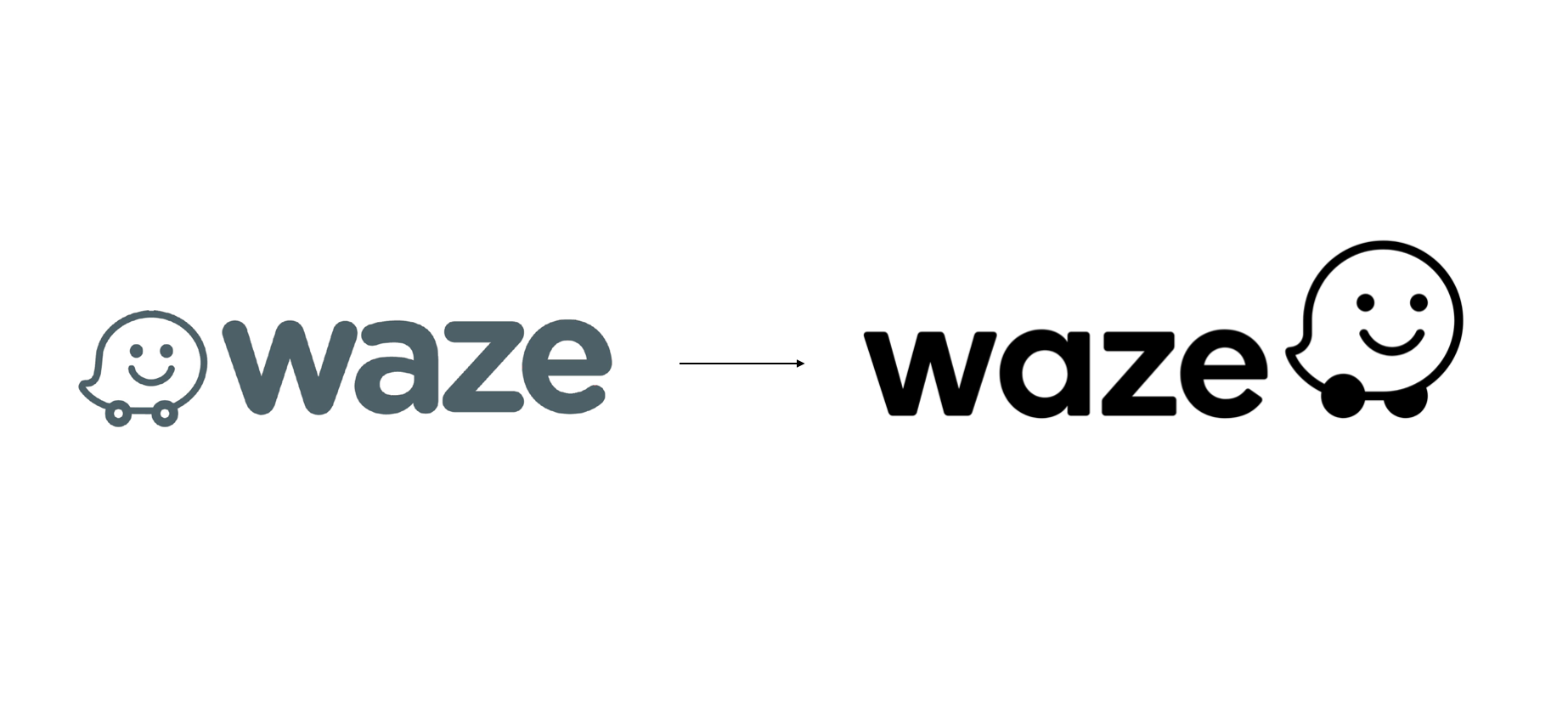
At the beginning of the project, my main focus is to revise the Wazer logomark and study its details.
Before
After
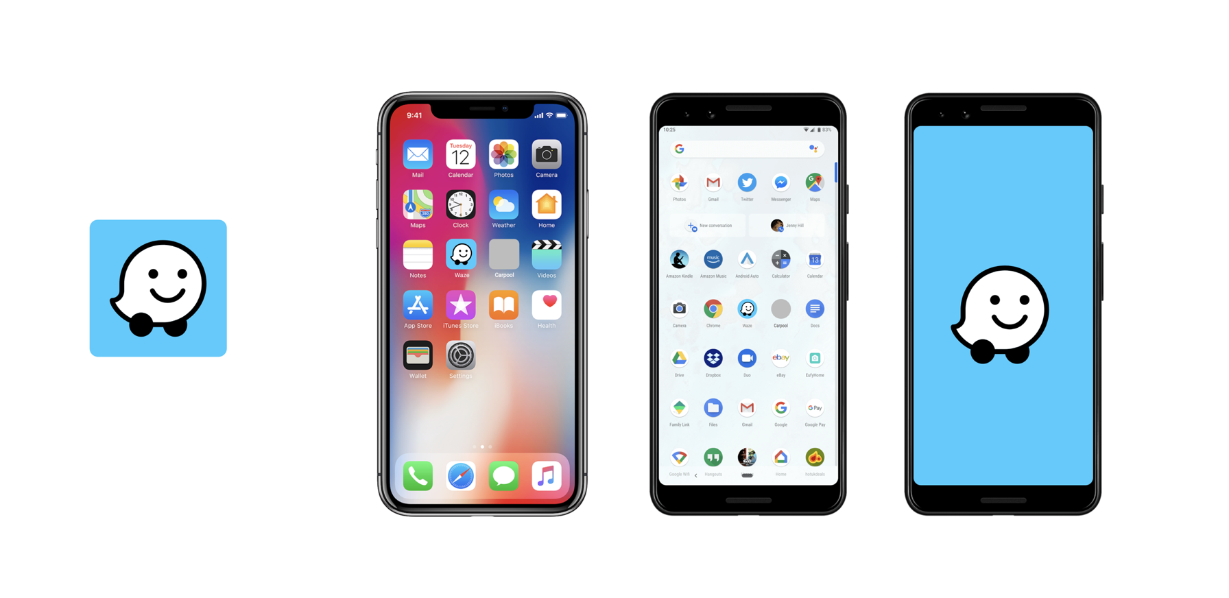
Final app icon designed by me

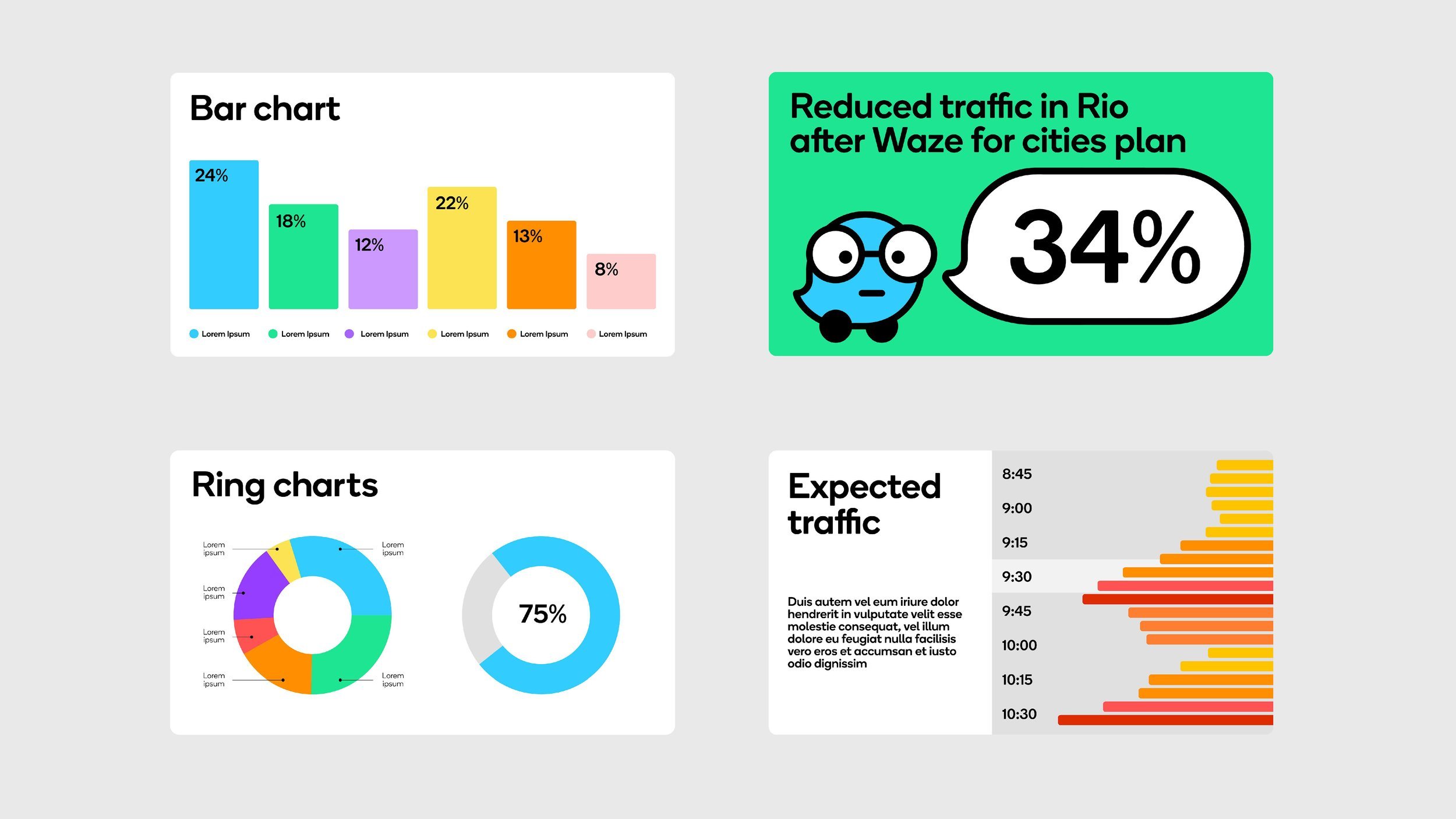
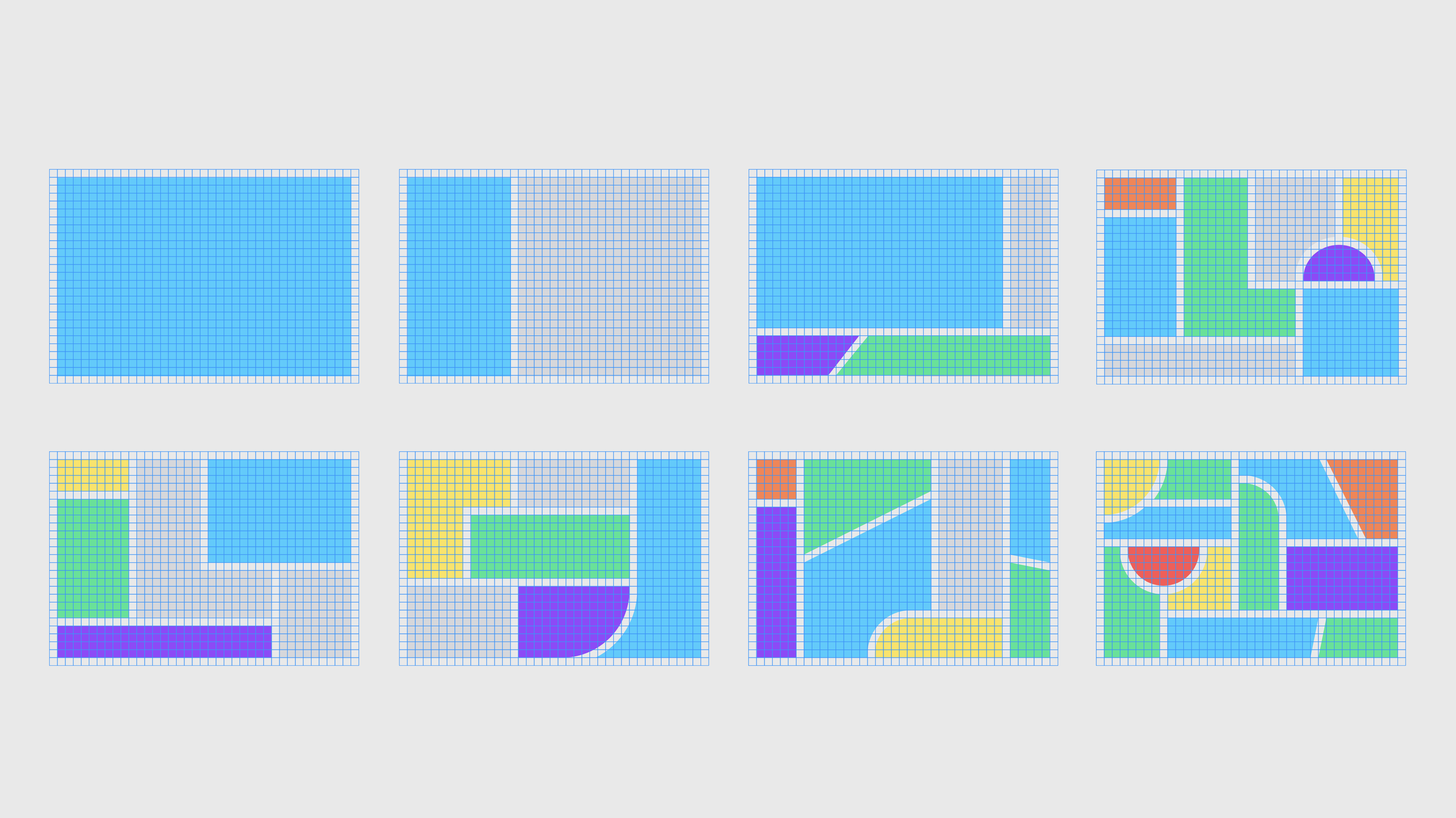
Visual System
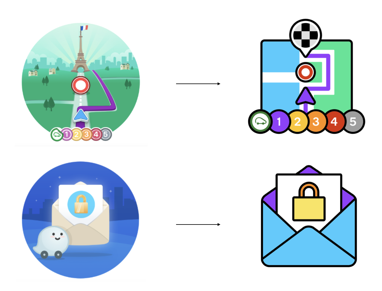
To make sure the system ensures consistency across a range of assets, from infographics to social posts to email templates. the guidance I created here is based on the same style. Below are the icon designs for App UI.

Carefully created the visual elements for Block by Block visual system.
Before:
After:


Before
After
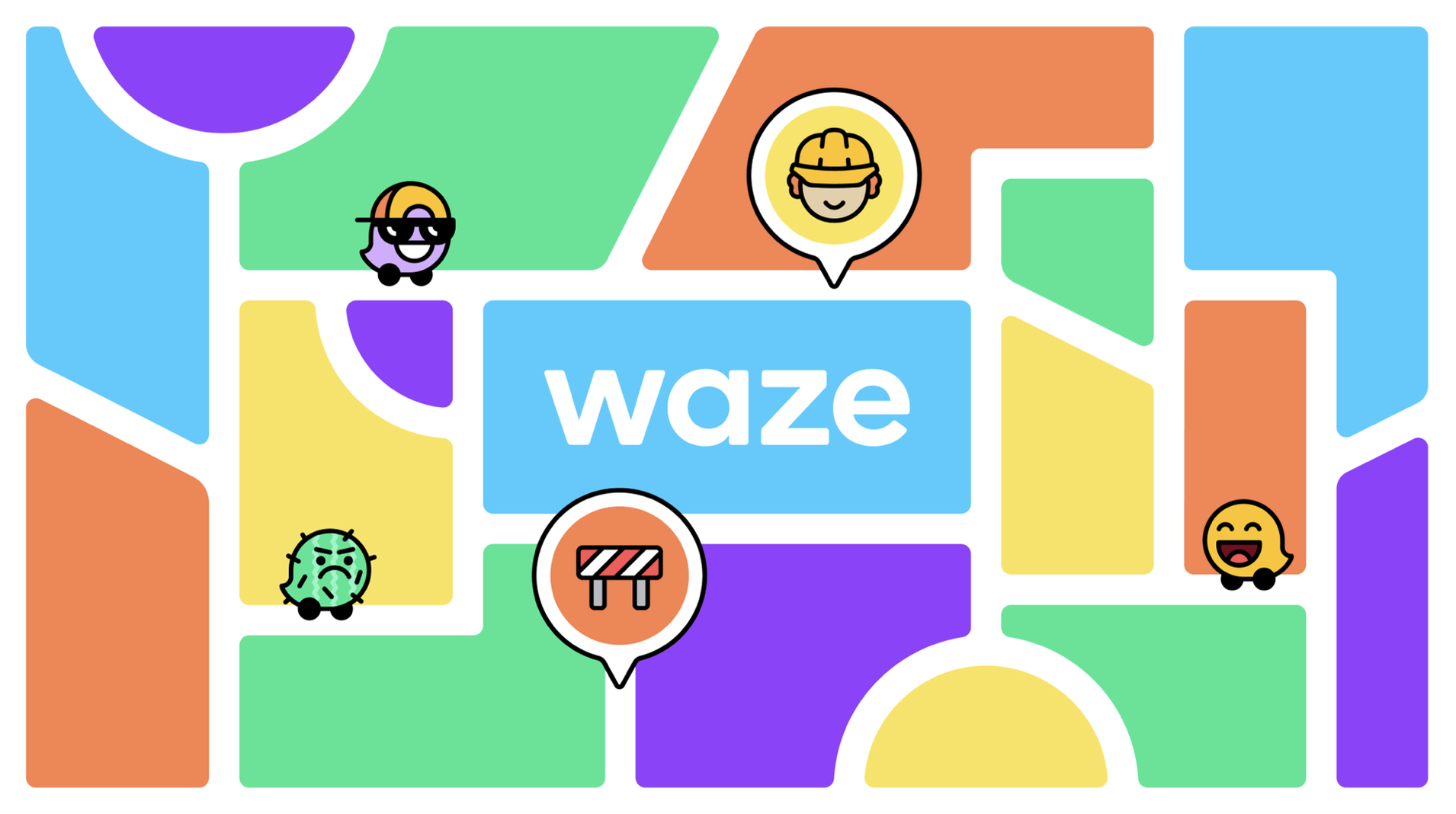
Spot Illustration
Illustration is a key component of Waze’s visual personality. As the app evolved over the years, its image style grew organically, resulting in different ways of depicting things like cities, locations and traffic events that when seen together were visually chaotic and confusing, and not helpful for drivers.
I redrew existing illustrations and icons and established a style guide for their creation going forward, to pare away unnecessary elements and make them look like they belong to the same system as the Wazer and Moods, without losing their vibrancy.
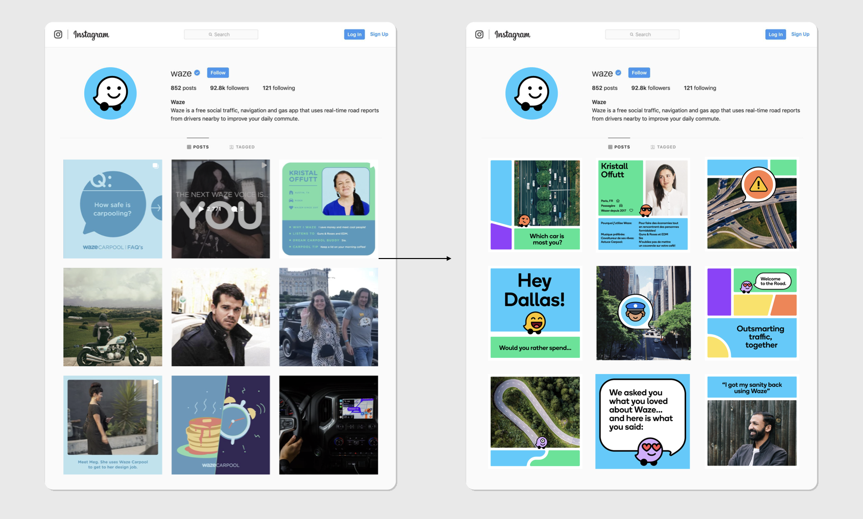
Visual Language_Block by Block
The system introduces a colorful visual language called “Block by Block” that is inspired by the modular design of the city grid, roads and streets. The refresh also included the development of a new brand voice and messaging that is bold, witty and welcoming.


UI Guidance
An underlying framework based on a geometric grid provides a strong but flexible foundation for the brand as it moves forward. The system builds on the minimalist Waze interface, which uses flat color and clean lines.
After the project got extended, I started design the UI guidance for apps other digial campaigns ads based on the visual language.
Web accessibility in mind
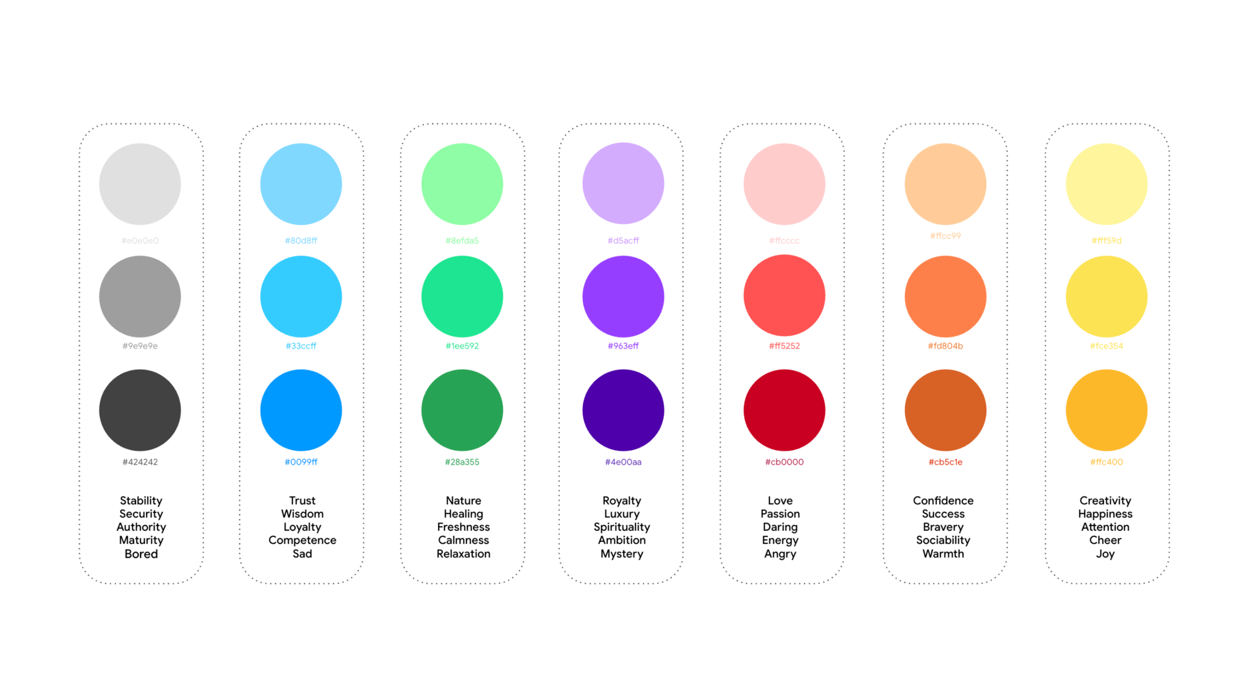
Color studies on how color connect to mood.


After delivering the final guidelines and assets, we collaborated with the Google Waze team to update the mood and icons to new designs. Animations here were created to showcase these changes.
In addition to the mentioned works here, there are more details on the guidelines.
Overall
As the lead senior designer on the project, my responsibilities include Waze symbol design and establishing a visual system. This system encompasses moods, iconography, spot illustrations, motion graphics, and UI design for website and app. Finally, deliver the completed guidelines to the client.


Key Visual
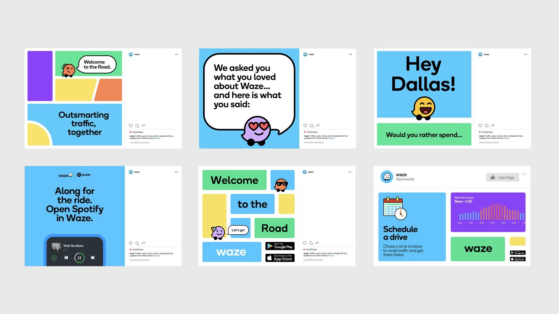
This grid comes to life in the new Block by Block visual language inspired by the modular design of the streetscape. The system organizes information into colorful “block-scapes”––from simple, elegant layouts to hectic, city-like structures––that create an instantly recognizable world of Waze across a multitude of contexts, from the app to social media and the Waze website.
I have carefully drawn all the key visuals for website design, social media posts and out-of-home billboards.


Alongside of Pentagram Design team, all visual assets below created by me.